Alright, looks like that's it for this session.
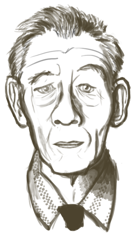
IF:
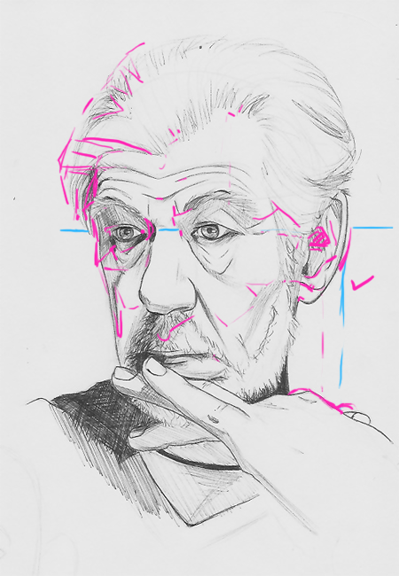
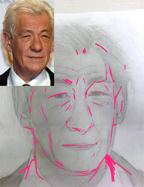
Very good! I like the sensitive use of hatching especially on the bags of his eyes and the left cheek specifically.
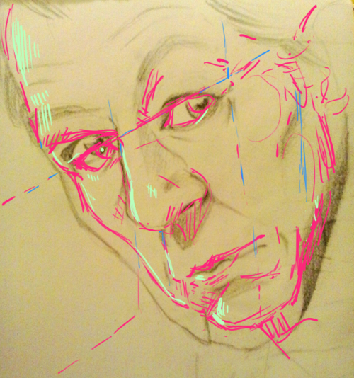
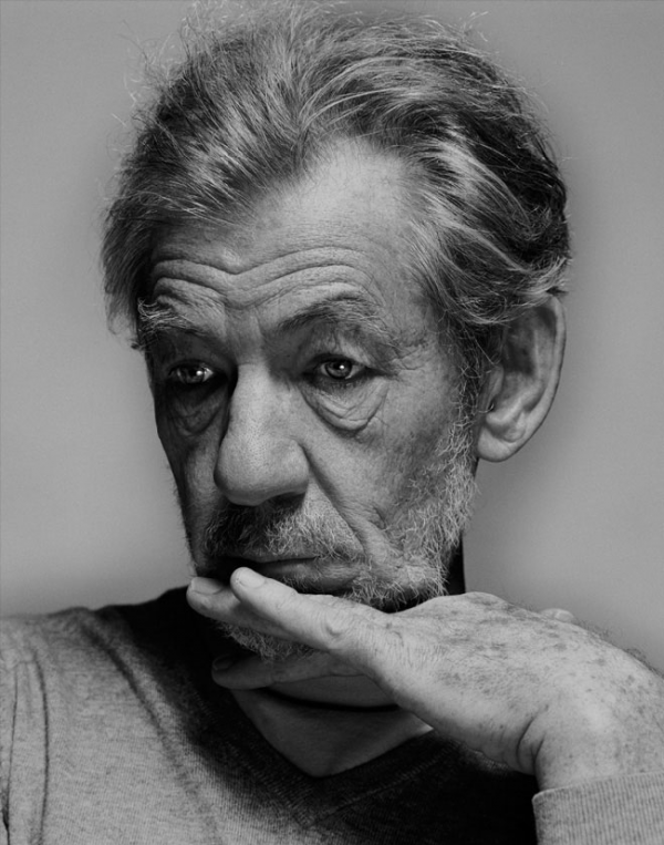
Space between nose and mouth is a little long. Top half of the head is a little bit narrower than the photo, the hair and his right cheek bone could come out a little more. Most importantly though, almost all the details line up! I was able to draw a line from one point to any other point and like 95% of them time everything matched up. Excellent proportions.
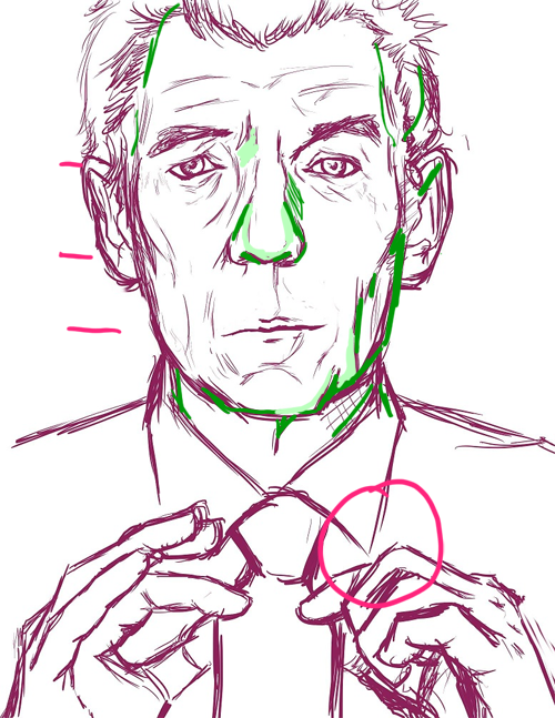
Runes:

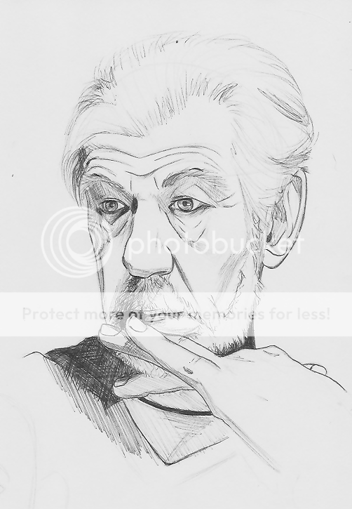
Size of the face in relation to the head is correct though the nose and mouth are a bit far down. Left cheek is coming out too far so his head is wider than it should be. Take care with line weights his eye lids don't look as heavy as they should because the same line thickness is applied all over. Lines on the top lid would be heavier as they also cast a shadow over the eye.
Make sure to check the proportions by aligning the details.
Example:
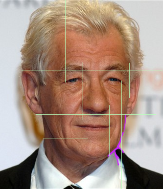
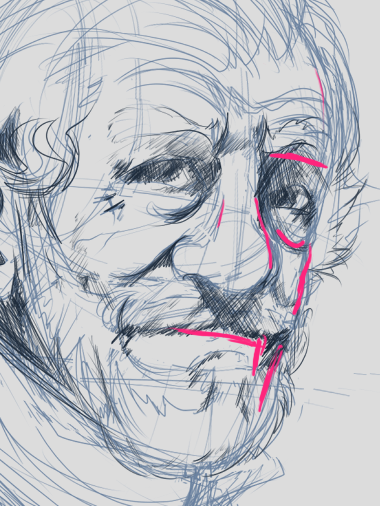
Notice how the left side of his nose lines up to the mouth as well as the inside of the white shirt.
The neck on your piece looks much thicker because the inside of the white shirt aligns to the outer edge of his eye.
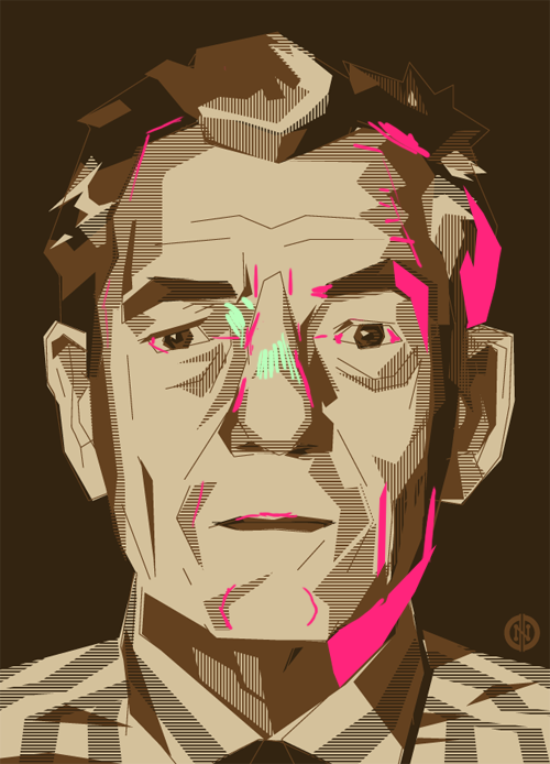
Take care with your shading. Like I said earlier, don't treat shading like bucket fill. Apply shading to convey shape/form not colour.
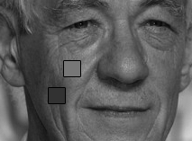
Those are spots colour picked from his nose tip and the shadow on his cheek. Pretty big difference when you see them like that.
Even more so like this:

Also, you mentioned you were working from your phone? I'm thinking that it might have been harder to really see what you're drawing at that size. I've got an extra big screen and even so that picture was kinda small. You might have an easier time with a big clear picture on a bigger screen.
Lesson review:So, what I was aiming for in that lesson was to get a feel for how everyone worked but also get you guys to really analyse your subject matter.
I can see everyone has looked really closely at the details of Sir Ian's face and I think a few of you ran into trouble when those details sort of ballooned out or the spaces between details felt greater than they actually were.
That cartoony image of an artist closing one eye and holding up their pencil or brush is actually a thing. It's for 1. aligning details 2. checking angles 3. comparing proportions. I did that a lot while comparing your drawings to the reference images. I totally recommend doing this. Might seem silly to anyone not used to it but it's pretty useful when trying to draw accurately to what you're seeing.
A note on 'fuzzing' or 'making it up'.
I pointed it out twice on the collar where the hand meets. It probably seemed super insignificant but the reason it's important not to 'fuzz' is that when it comes time to draw from memory/imagination you want to have an accurate idea in your head. But your memories aren't gonna be very accurate if during your study drawings you only half looked at your subject and finished the rest on an idea of the subject.
I can draw something that looks like a bicycle, but if I were to try and make it look good I'd fail as they aren't something I've got committed to my memory. So I grab some reference and do some studies so I can try draw it from other angles should I ever need to. But say I never bother looking at the spokes. Where they meet up, how they connect, how thick they really are. I just make it up for each of my studies because it's roughly what they look like and people will get the idea.
I tell ya what, it'll look pretty bad if I ever got asked to draw a bicycle.
The other thing too is those details can be used to help keep the rest of the picture in proportion. If you make stuff up you may find your proportions getting messed up.
Hopefully you guys have already gotten something out of last weeks lesson.
Let me know if there's anything that confuses you.
Art Class: Lesson #2Hands!Or feet if you aren't feeling challenged enough.
Try drawing your own hands or a family members hands/feet. (Photos are fine too but your hands and feet are right there, so convenient.)
Try different gestures and angles too.
These are a few studies by an up and coming comic artist, Cassandra James.
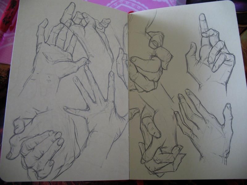
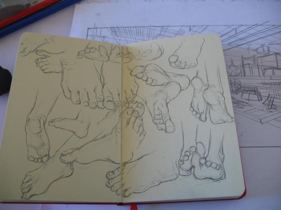
I'd like to see a minimum of 4 studies and some different positions like a fist or thumbs up.
Also: Are all you guys seeing my pictures? I got told photobucket is really shitty and doesn't always show up.
_________________

Quote:
Being FitBit friends with Dire is like the most painful thing ever


