With rotations I think the key is to make sure all the details are accurate from every angle, you've got a few hiccups where things aren't quite the right size
For example the belly armour thing in the front view goes right up to her breasts, but in every other one it's a bit lower, same kinda thing with the leg armour stuff. I can see you got those little marks at certain places as guides but I'd advise drawing lines all the way across and do them where ever you are even slightly unsure that something isn't in the right place, you can always rub them out.
Her character comes through clearly which is good, a lot of people think doing a rotation means your character has to stand neutral which is boring boring boring. Though some of them do lose the strength of the pose, in the frontal her feet are wide apart and her arms are spread which means she takes up a large area which suits her well, but the others lose this a bit because they aren't really drawn in perspective. The viewer doesn't
feel that her legs are wide apart. Demonstrating perspective skill is a big plus.
While on perspective, it's wonky as heck in the big bar image. I've drawn some lines over it to demonstrate why
http://sadpanda.us/images/1873123-UHKDVPG.jpg I've sloppily followed the lines of the table to the table's vanishing point which is on the horizon of the image. Everything above the horizon is technically floating; the bar, the dudes at the other table. You could fix this by removing/changing the background so that the image feels more enclosed and focussed on the group in front. I mean is the background really necessary? It doesn't give any extra information since the tankards and merriment are indication enough that they're in a tavern. If you're set on a full scene you'll really have to redraw the entire thing.
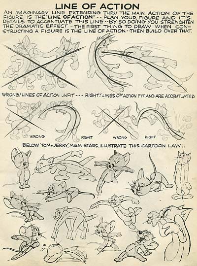
For the poses you should read up on the concepts of gesture, line of action and rhythm
Here are some images that go over them for a quick gist
http://johnkstuff.blogspot.com/uploaded ... 749469.jpghttp://radsechrist.deviantart.com/art/b ... -270201103http://radsechrist.deviantart.com/art/Rhythm-261045593http://trotroy.deviantart.com/art/HOW-T ... -209542995 The artist here uses Glen Keane as an example and if you aren't familiar with him already I advise you to familiarize yourself with every pencil mark he's ever made
I did this scribble to try illustrate how you can implement these ideas in one of your poses
http://sadpanda.us/images/1873130-B9KIJOB.jpg The thing on the right is a very simplified interpretation of the motion, it's what I started with but has been lost under the other marks. I might have changed the idea of the image a bit, in mine I tried to make it clear that she's beating the dragon, as the next image implies, so I made it clear that she's standing over it with a strong pose and it's cowering away. (referring to the ideas in
http://radsechrist.deviantart.com/art/b ... -270201103) If you wanted it to look like an intense fight I'd suggest entangling them or giving them both strong poses.
I think that's pretty much all I have to comment on at the moment.
Oh yeah the guy slapping her butt while she's sitting down is a bit implausible.


