The Willow Witch wrote:
So over this weekend I did a 24 hour painting event, which basically you spend 24 hours straight dedicating yourself to make a complete painting, using the art process + references + whatever you need to finish the piece.
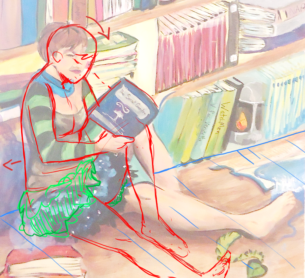
The theme for the paintings was Independence, and my word was Imagination.
It was basically like this big artistic sleepover at my friends church hall because we couldn't hold it in the school this year, and we braught a whole lot of food and I honestly got only one hour of sleep out of 24.
Here is the process of my piece.Here is the finished piece.seriously it took 15 hours to paint all those books.
So what does everyone think? What I did good or what I could have done better? For a long time I have the proportions off
I like the over all composition, it's a tall piece that's broken up by a lot of horizontal lines (the shelves) and then some vertical lines again (the books)
Some of your colour groupings are very pleasing to the eye, specifically the bottom shelf, I think I would have liked to see more of that through out the rest of the painting, Not that the mixed colours are bad (it's meant to be a colourful piece after all) But I think it could make this even more appealing.
Issues I'm noting are mainly with surface planes and perspectives. I don't know if you were going for wonky, but the books and shelves are sort of all over the place in terms of perspective, some books seem to be viewed from a bit higher than others on the same shelf.
The floor plane also seems inconsistent, like the shadow past her right leg on the floor makes the floor there look like a table or mound she is setting next to as opposed to the same floor plane she's sitting on. The books in the foreground also don't quite match the plane they are sitting on.
As far as anatomy goes I think her lower back dips in a bit too far compared to her upper back making her look like she has a hunched back as opposed to simply being hunched over to read. If she's actually meant to be sitting up straight then her upper back is showing too much.
Due the way the skirt(also the bottom of the shirt) isn't really folding or creased it looks like her left leg is attached funny, like it's higher up on her torso and off to the side like a lizard leg.
I think her cleavage is a bit far left, it makes her left boob look tiny and her right boob looks like it's pushed over that may.
The over all proportions of the body are correct though. Just more a matter of posture and clothing folds that are making her look weird.
I dunno if it was a requirement of the session or what but I'm not a fan of the text. I think you've gotten the idea across already with all the little bits and pieces floating around the books (the fairies and stuff). So I don't think the text is necessary.
_________________

Quote:
Being FitBit friends with Dire is like the most painful thing ever


